The existing way of presenting the data in trends can be a little hard to digest so Here is a simple marketing research trick for those who wants to get an idea on search behaviors by time of day & day of week using Google Trends & Excel.
Note that this is only limited to the last 7 days as Google limits the data.
But if you happen to have access to a larger set of data, the same techniques apply.
Firstly, identify the terms you will be using for your research.
If you are after upper funnel searches, use broader such as beer, tea, etc and if you are after lower funnel searches try using branded terms such as carlsberg, liption as this tend to signal higher intent.
If possible, do both and you might get an insight on how the behaviors differ, if at all.
If possible, do both and you might get an insight on how the behaviors differ, if at all.
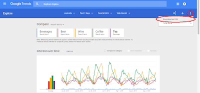
Head on to Google Trends, key in the terms and export the 7 day data into CSV.
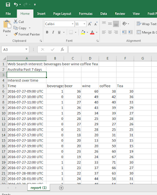
Your data should look like this:
There is additional data in the export such as search location, top searches etc.
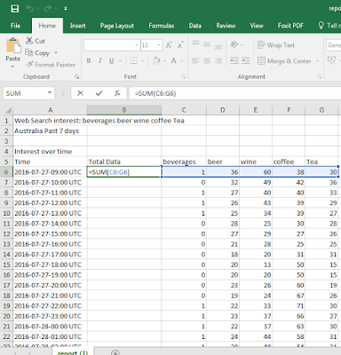
For simplicity sake, lets assume we just want the insight on a broad level on what day of week & hour people search for beverages such as beer, wine, coffee, tea.
So lets group the indexed search volume data into 1:
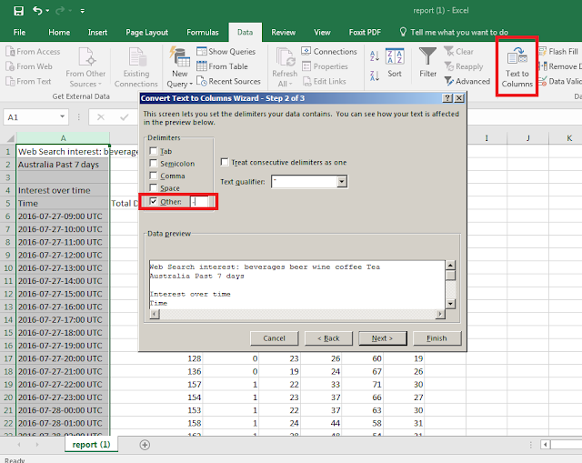
Now lets extract the Hourly data by using the text to column function in excel. You can do it manually, but this is much quicker:
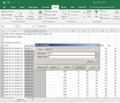
Once done, just remove the UTC using replace function & add a header called Hour of day:
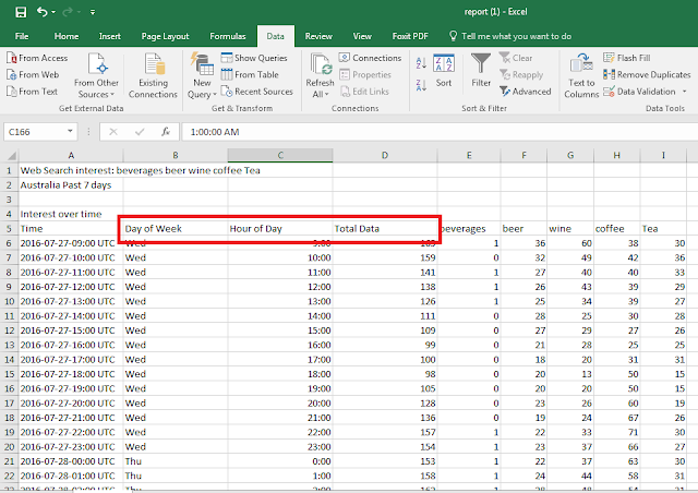
Now create another column for the day of week & you should have 3 new columns in total.
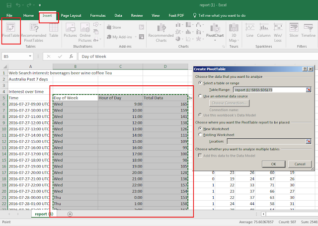
Now, all you need to do is to pivot table the 3 newly created columns:
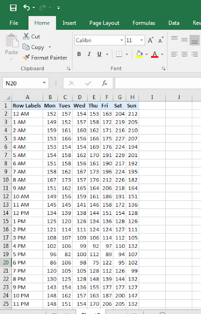
Your goal is to end up with results like this:
Next is to make it visually engaging via heat mapping the data.
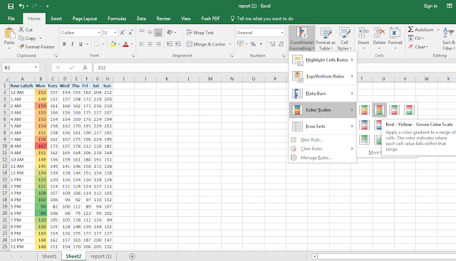
For this we shall use conditional formatting. Red to indicate high activity and green for low activity.
Repeat this for each day of week.
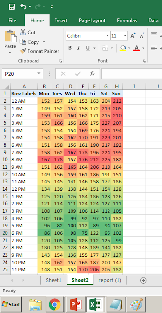
It is important to do this separately for each day of week so you get an accurate picture:
From here we can gather that most people search for beer, wine, tea & coffee most from 12am to 9am and especially so during weekends (probably caused by beer & wine).
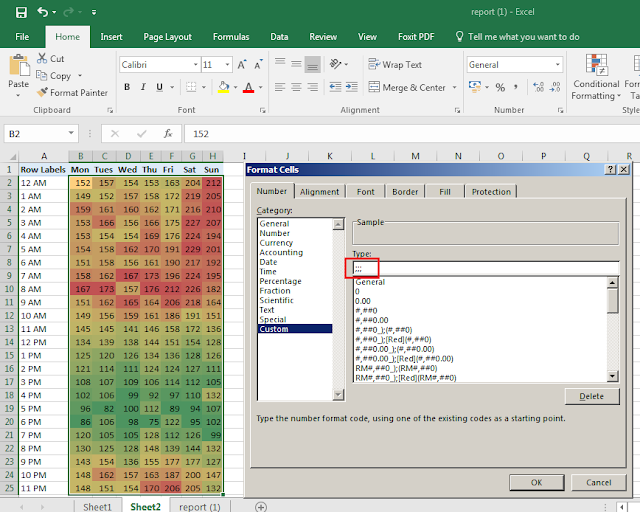
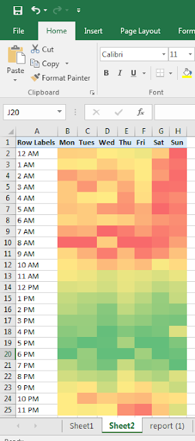
To go the extra mile to make this more visually appealing, you can choose to make the numbers transparent in the cells by formatting it. Select the format cell function, then go to 'General' & enter ';;;'
End Result:
Hope this helps!
Reliable tool for seamless data collection.
ReplyDeletewww.letsextract.com